Cell Color Picker
A compact color picker styled as a settings cell, with a leading label and a trailing swatch and live hex value.
Import
import { ColorPicker, ColorArea, ColorSlider } from '@darkcode-ui/react';The cell color picker is the standard ColorPicker rendered
in its cell layout: pass the variant prop and compose the ColorPicker.Label,
ColorPicker.Swatch, and ColorPicker.ValueDisplay parts inside the trigger.
Usage
"use client";

import {ColorArea, ColorPicker, ColorSlider} from "@darkcode-ui/react";

export function Default() {Anatomy
The trigger becomes a full-width settings-cell row: a leading Label on the left, and a
trailing cluster with the Swatch preview and the live hex ValueDisplay on the right.
import { ColorPicker, ColorArea, ColorSlider } from '@darkcode-ui/react';

export default () => (
  <ColorPicker defaultValue="#0485F7" variant="default">
    <ColorPicker.Trigger>
      <ColorPicker.Label>Background</ColorPicker.Label>
      <div className="flex items-center gap-2">
        <ColorPicker.Swatch size="sm" />
        <ColorPicker.ValueDisplay />
      </div>
    </ColorPicker.Trigger>
    <ColorPicker.Popover>
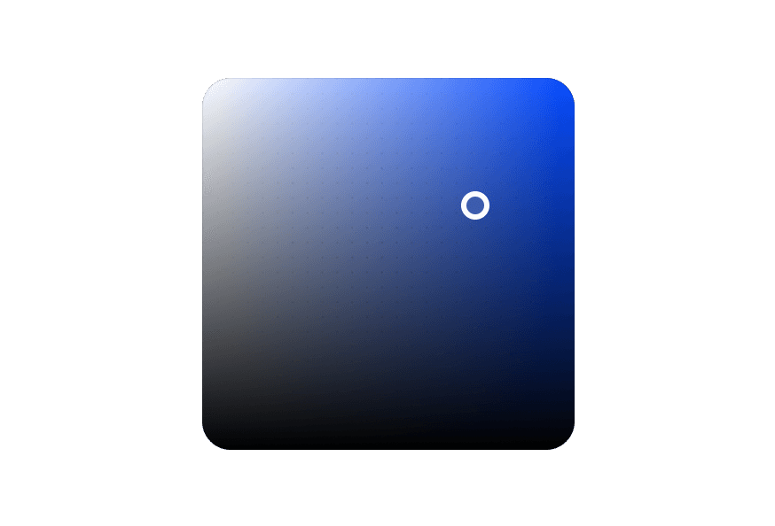
      <ColorArea colorSpace="hsb" xChannel="saturation" yChannel="brightness">
        <ColorArea.Thumb />
      </ColorArea>
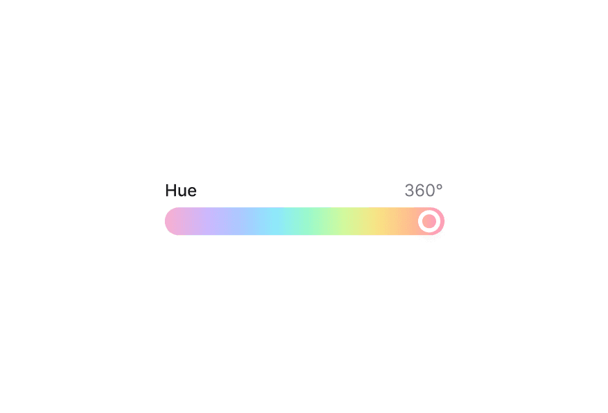
      <ColorSlider channel="hue" colorSpace="hsb">
        <ColorSlider.Track>
          <ColorSlider.Thumb />
        </ColorSlider.Track>
      </ColorSlider>
    </ColorPicker.Popover>
  </ColorPicker>
);
Controlled
Pass value and onChange to control the selected color. ColorPicker.ValueDisplay
reflects the current value automatically.
"use client";

import {ColorArea, ColorPicker, ColorSlider, parseColor} from "@darkcode-ui/react";
import {useState} from "react";
Disabled
Pass isDisabled to disable the cell.
"use client";

import {ColorArea, ColorPicker, ColorSlider} from "@darkcode-ui/react";

export function Disabled() {Settings Group
Stack multiple cells in a single inset panel with merged corners and hairline dividers, ideal for preference and configuration forms.
"use client";

import {ColorArea, ColorPicker, ColorSlider} from "@darkcode-ui/react";

const cells = [Variants
Use variant="secondary" for an accent-tinted cell. The variant styles the trigger row.
"use client";

import {ColorArea, ColorPicker, ColorSlider} from "@darkcode-ui/react";

const variants = [With Presets
Add a ColorSwatchPicker inside the popover to offer a palette of preset colors alongside
the full picker.
"use client";

import {ColorArea, ColorPicker, ColorSlider, ColorSwatchPicker} from "@darkcode-ui/react";

const presets = [Styling
The cell color picker is the ColorPicker component, so all
of its styling patterns apply. The cell layout is provided by the variant modifier and the
BEM classes below.
CSS Classes
The cell layout uses the following CSS classes (View source styles):
Base Classes
.color-picker- Root wrapper.color-picker__trigger- The visible cell row button.color-picker__popover- Dropdown color picker panel
Element Classes
.color-picker__trigger--default- Default variant trigger styling.color-picker__trigger--secondary- Secondary variant trigger styling.color-picker__label- Leading text label.color-picker__value-display- Live hex value text.color-picker__swatch- Color swatch preview
Interactive States
The component supports both CSS pseudo-classes and data attributes:
- Focus:
:focus-visibleor[data-focus-visible="true"] - Disabled:
:disabledor[data-disabled="true"]
API Reference
ColorPicker
The root component. Add the variant prop to enable the cell layout.
| Prop | Type | Default | Description |
|---|---|---|---|
variant | 'default' | 'secondary' | - | Renders the trigger as a settings-cell row. When omitted, the trigger stays a compact inline trigger. |
Also supports all DarkCode UI ColorPicker props
(value, defaultValue, onChange, isDisabled, etc.).
ColorPicker.Trigger
The visible cell row button. Wraps React Aria Button.
Also supports all React Aria Button props.
ColorPicker.Label
Leading text label rendered as a span.
| Prop | Type | Default | Description |
|---|---|---|---|
children | ReactNode | - | Label text |
Also supports all native span HTML attributes.
ColorPicker.ValueDisplay
Displays the current color as a hex value (e.g. #FF5733). Reads from the color picker state
automatically.
| Prop | Type | Default | Description |
|---|---|---|---|
uppercase | boolean | true | Render the hex value in uppercase |
children | ReactNode | (({ hex }) => ReactNode) | - | Override the displayed content; receives the resolved hex string when a function |
Also supports all native span HTML attributes.
ColorPicker.Swatch
Color swatch preview. Wraps DarkCode UI ColorSwatch.
Also supports all DarkCode UI ColorSwatch props (size, shape, etc.).
ColorPicker.Popover
Dropdown color picker panel.
| Prop | Type | Default | Description |
|---|---|---|---|
placement | Placement | 'bottom left' | Popover placement relative to the trigger |
Also supports all DarkCode UI ColorPicker.Popover props.