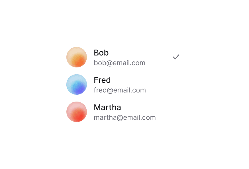
List View
A single-column interactive list with keyboard navigation, selection, and accessible item actions — built on React Aria's GridList.
Import
import { ListView } from '@darkcode-ui/react';Usage
The ListView component displays a list of interactive items with built-in keyboard
navigation, typeahead search, and selection. Pass your data to the items prop and render each
row with a function child.
"use client";

import {Button, ListView} from "@darkcode-ui/react";
import {Icon} from "@iconify/react";
Anatomy
Import the ListView component and access all parts using dot notation. Each Item holds an
ItemContent (icon/avatar + text) and an optional trailing ItemAction. Selection checkboxes
are rendered automatically when selection is enabled.
import { ListView, Button } from '@darkcode-ui/react';

<ListView aria-label="Files" items={files} selectionMode="multiple">
  {(file) => (
    <ListView.Item id={file.id} textValue={file.name}>
      <ListView.ItemContent>
        <FileIcon />
        <div>
          <ListView.Title>{file.name}</ListView.Title>
          <ListView.Description>{file.size}</ListView.Description>
        </div>
      </ListView.ItemContent>
      <ListView.ItemAction>
        <Button isIconOnly size="sm" variant="ghost">
          <Ellipsis />
        </Button>
      </ListView.ItemAction>
    </ListView.Item>
  )}
</ListView>
Selection Modes
ListView supports three selection modes: none (read-only), single (radio-style), and
multiple (checkboxes). Selection checkboxes are rendered automatically when selection is
enabled.
"use client";

import {ListView} from "@darkcode-ui/react";
import {Icon} from "@iconify/react";
Variants
Use the variant prop to switch between the two visual styles.
- Primary (default) — gray background wrapper with surface-tinted rows forming a card shape.
- Secondary — no wrapper; transparent rows separated by hairline borders with accent selection.
"use client";

import {ListView} from "@darkcode-ui/react";
import {Icon} from "@iconify/react";
Secondary
The secondary variant drops the card wrapper for a flatter, divided list — ideal inside panels that already provide their own surface.
"use client";

import {Button, ListView} from "@darkcode-ui/react";
import {Icon} from "@iconify/react";
Disabled Items
Use the disabledKeys prop to disable specific items. Disabled items cannot be selected,
focused, or interacted with.
"use client";

import {ListView} from "@darkcode-ui/react";
import {Icon} from "@iconify/react";
With Action Bar
Combine with ActionBar for bulk selection workflows. The ActionBar appears when items are selected and provides contextual actions.
"use client";

import type {Selection} from "@darkcode-ui/react";

import {ActionBar, Button, ListView} from "@darkcode-ui/react";Virtualization
For very large datasets, pass virtualized (and optionally rowHeight) to render only the
visible rows. Give the list a fixed height so it can scroll.
<ListView
  aria-label="Files"
  items={files}
  selectionMode="multiple"
  virtualized
  rowHeight={56}
  className="h-[400px] overflow-y-auto"
>
  {(file) => <ListView.Item id={file.id} textValue={file.name}>{/* ... */}</ListView.Item>}
</ListView>
CSS Classes
Base Classes
.list-view— Root container. Setsmin-height: 0, full width, andoutline: none..list-view--primary— Gray background wrapper with padding and large border-radius. Rows tint with the surface color..list-view--secondary— No background or padding. Rows are transparent with bottom borders.
Element Classes
.list-view__item— Individual row. Flex layout with gap, padding, and interactive states..list-view__item-content— Main content area (icon + text). Flex withmin-width: 0for truncation..list-view__title— Primary text. Truncated,text-sm font-medium..list-view__description— Secondary text. Truncated,text-xs text-muted..list-view__item-action— Trailing action slot. Auto-margin to the end..list-view__selection-cell— Checkbox area. Fixed width, flex-shrink: 0..list-view__selection-control— The selection checkbox (circular in single-selection mode)..list-view__empty-state— Centered empty-state container.
Interactive States
- Hover:
bg-surface/40(primary) orbg-default/50(secondary). - Selected:
bg-surface/70(primary) orbg-accent-soft(secondary). - Focus visible: Inset focus ring via
box-shadow: inset 0 0 0 2px var(--focus). - Disabled:
status-disabledutility. - Dragging:
opacity: 0.5.
API Reference
ListView
The root list component. Accepts a generic type parameter T for the item data shape. Extends
RAC GridListProps.
| Prop | Type | Default | Description |
|---|---|---|---|
aria-label | string | — | Accessible label for the list. Required. |
variant | 'primary' | 'secondary' | 'primary' | Visual variant. |
selectionMode | 'none' | 'single' | 'multiple' | 'none' | Item selection mode. |
selectedKeys | Selection | — | Controlled selected item keys. |
defaultSelectedKeys | Selection | — | Default selected keys (uncontrolled). |
onSelectionChange | (keys: Selection) => void | — | Callback when selection changes. |
selectionBehavior | 'toggle' | 'replace' | 'toggle' | Selection interaction model. |
items | Iterable<T> | — | Item objects for dynamic collections. |
disabledKeys | Iterable<Key> | — | Keys of items that should be disabled. |
onAction | (key: Key) => void | — | Callback when a user performs an action on an item. |
renderEmptyState | () => ReactNode | — | Render function for the empty state. |
virtualized | boolean | false | Enable row virtualization for large datasets. |
rowHeight | number | 56 | Estimated row height in pixels for virtualization. |
className | string | — | Additional CSS classes. |
children | ReactNode | ((item: T) => ReactNode) | — | Static items or render function for dynamic collections. |
ListView.Item
Individual list item. Extends RAC GridListItemProps.
| Prop | Type | Default | Description |
|---|---|---|---|
id | Key | — | Unique item identifier. |
textValue | string | — | String representation for typeahead and accessibility. |
isDisabled | boolean | — | Whether the item is disabled. |
href | string | — | URL to navigate to when the item is actioned. |
children | ReactNode | — | Item content — typically ItemContent and optionally ItemAction. |
className | string | — | Additional CSS classes. |
ListView.ItemContent
Main content container for the item (icon/avatar + text).
ListView.Title
Primary text element inside an item.
ListView.Description
Secondary/muted text element inside an item.
ListView.ItemAction
Trailing action slot inside an item.
Accessibility
ListView is built on the React Aria GridList primitive and provides:
- Full keyboard navigation (Arrow keys, Home, End, Page Up/Down, type-ahead)
- Single and multiple selection with
Space/Enterand modifier keys - Roving tabindex and proper
row/gridcellroles - Disabled item handling that skips focus and interaction
For more information, see the React Aria GridList documentation.