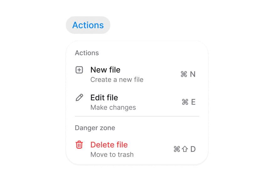
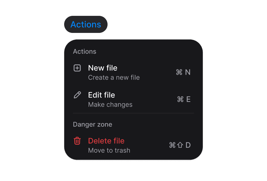
Context Menu
A right-click context menu with nested submenus, selection state, and long-press support for touch
Import
import { ContextMenu } from '@darkcode-ui/react';Usage
"use client";

import {ContextMenu, Label} from "@darkcode-ui/react";

export function Default() {Anatomy
Import the ContextMenu component and access all parts using dot notation.
import { ContextMenu, Label, Header } from '@darkcode-ui/react';

export default () => (
  <ContextMenu>
    <ContextMenu.Trigger />
    <ContextMenu.Popover>
      <ContextMenu.Menu>
        <ContextMenu.Section>
          <Header />
          <ContextMenu.Item>
            <Label />
            <ContextMenu.ItemIndicator />
          </ContextMenu.Item>
        </ContextMenu.Section>
        <ContextMenu.Separator />
        <ContextMenu.SubmenuTrigger>
          <ContextMenu.Item>
            <Label />
            <ContextMenu.SubmenuIndicator />
          </ContextMenu.Item>
          <ContextMenu.Popover>
            <ContextMenu.Menu>
              <ContextMenu.Item />
            </ContextMenu.Menu>
          </ContextMenu.Popover>
        </ContextMenu.SubmenuTrigger>
      </ContextMenu.Menu>
    </ContextMenu.Popover>
  </ContextMenu>
)
Controlled
"use client";

import {ContextMenu, Label} from "@darkcode-ui/react";
import {useState} from "react";
Disabled
"use client";

import {ContextMenu, Label} from "@darkcode-ui/react";

export function Disabled() {Long Press
"use client";

import {ContextMenu, Label} from "@darkcode-ui/react";

export function LongPress() {With Sections
"use client";

import {ContextMenu, Header, Kbd, Label} from "@darkcode-ui/react";
import {Icon} from "@iconify/react";
With Selection
"use client";

import type {Selection} from "@darkcode-ui/react";

import {ContextMenu, Header, Label} from "@darkcode-ui/react";With Submenus
"use client";

import {ContextMenu, Label} from "@darkcode-ui/react";

export function WithSubmenus() {Styling
Passing Tailwind CSS classes
import { ContextMenu, Label } from '@darkcode-ui/react';

function CustomContextMenu() {
  return (
    <ContextMenu>
      <ContextMenu.Trigger className="rounded-lg border border-dashed p-8">
        Right click here
      </ContextMenu.Trigger>
      <ContextMenu.Popover className="min-w-[200px]">
        <ContextMenu.Menu>
          <ContextMenu.Item id="item-1" textValue="Item 1" className="hover:bg-surface-secondary">
            <Label>Item 1</Label>
          </ContextMenu.Item>
        </ContextMenu.Menu>
      </ContextMenu.Popover>
    </ContextMenu>
  );
}
Customizing the component classes
To customize the Context Menu component classes, you can use the @layer components directive.
Learn more.
@layer components {
  .context-menu__trigger {
    @apply relative inline-block;
  }

  .context-menu__popover {
    @apply rounded-lg border border-border bg-overlay p-2;
  }

  .context-menu__menu {
    @apply flex flex-col gap-0.5;
  }

  .context-menu__separator {
    @apply bg-separator;
  }
}
DarkCode UI follows the BEM methodology to ensure component variants and states are reusable and easy to customize.
CSS Classes
The Context Menu component uses these CSS classes (View source styles):
Element Classes
.context-menu__trigger— The right-click target area. Relatively positionedinline-blockwith-webkit-touch-callout: nonefor long-press support..context-menu__popover— The floating menu panel positioned at the cursor. Hasbg-overlay,shadow-overlay, rounded corners, and enter/exit animations..context-menu__menu— The list of menu items inside the popover..context-menu__separator— Horizontal divider between menu groups (bg-separator).
Interactive States
- Entering:
[data-entering="true"]on.context-menu__popover—fade-in+zoom-in-90with placement-aware slide (150ms). - Exiting:
[data-exiting="true"]on.context-menu__popover—fade-out+zoom-out-95(100ms). - Placement slide:
[data-placement="top"]slides from bottom,[data-placement="bottom"]from top,[data-placement="left"]from right,[data-placement="right"]from left. - Focus visible:
.context-menu__popover[data-focus-visible="true"]— outline suppressed. - Reduced motion:
motion-reduce:animate-noneon entering/exiting states.
The Context Menu reuses the Menu, MenuItem, and MenuSection base components for its items, so their classes (.menu-item, .menu-item__indicator, .menu-section, …) are also available for customization. See the Dropdown documentation for the full list.
API Reference
ContextMenu
The root provider that manages open state and cursor positioning.
| Prop | Type | Default | Description |
|---|---|---|---|
open | boolean | — | Controlled open state. |
defaultOpen | boolean | false | Initial open state (uncontrolled). |
onOpenChange | (open: boolean) => void | — | Callback when open state changes. |
isDisabled | boolean | false | Whether the context menu is disabled. |
children | ReactNode | — | Context menu content. |
ContextMenu.Trigger
The right-click (or long-press) target area. Renders a <div> by default.
| Prop | Type | Default | Description |
|---|---|---|---|
children | ReactNode | — | Content that can be right-clicked. |
className | string | — | Additional CSS classes. |
ContextMenu.Popover
The floating panel positioned at the cursor coordinates.
| Prop | Type | Default | Description |
|---|---|---|---|
offset | number | 2 | Distance from the anchor point in pixels. |
placement | Placement | "bottom start" | Preferred placement relative to the cursor. |
className | string | — | Additional CSS classes. |
children | ReactNode | — | Popover content. |
Also supports all React Aria Popover props (except isOpen, triggerRef, and onOpenChange).
ContextMenu.Menu
The list of menu items. Automatically closes the context menu when an item is selected.
| Prop | Type | Default | Description |
|---|---|---|---|
onClose | () => void | — | Custom close handler. Defaults to closing the context menu. |
selectionMode | "single" | "multiple" | "none" | "none" | Whether single or multiple selection is enabled. |
selectedKeys | Iterable<Key> | — | The currently selected keys (controlled). |
onSelectionChange | (keys: Selection) => void | — | Handler called when the selection changes. |
disabledKeys | Iterable<Key> | — | Keys of disabled items. |
onAction | (key: Key) => void | — | Handler called when an item is activated. |
Also supports all React Aria Menu props.
ContextMenu.Item
An individual menu item. Re-exports the DarkCode UI Dropdown item.
| Prop | Type | Default | Description |
|---|---|---|---|
id | Key | — | Unique identifier for the item. |
textValue | string | — | Text content of the item for typeahead. |
variant | "default" | "danger" | "default" | Visual variant of the item. |
className | string | — | Additional CSS classes. |
Also supports all Dropdown.Item props.
ContextMenu.ItemIndicator
Selection indicator for checkbox/radio menu items.
| Prop | Type | Default | Description |
|---|---|---|---|
type | "checkmark" | "dot" | "checkmark" | Type of indicator to display. |
ContextMenu.Section
Groups related menu items. Re-exports the DarkCode UI Dropdown section.
Also supports all Dropdown.Section props.
ContextMenu.SubmenuTrigger
Wraps a menu item that opens a nested submenu on hover.
Also supports all Dropdown.SubmenuTrigger props.
ContextMenu.SubmenuIndicator
Chevron icon indicating a submenu.
| Prop | Type | Default | Description |
|---|---|---|---|
className | string | — | Additional CSS classes. |
children | ReactNode | — | Custom indicator content. |
ContextMenu.Separator
A horizontal divider between menu groups.
Also supports all React Aria Separator props.
Examples
Basic Usage
import { ContextMenu, Label } from '@darkcode-ui/react';

<ContextMenu>
  <ContextMenu.Trigger className="flex h-44 w-80 items-center justify-center rounded-xl border border-dashed">
    Right click here
  </ContextMenu.Trigger>
  <ContextMenu.Popover>
    <ContextMenu.Menu onAction={(key) => alert(`Selected: ${key}`)}>
      <ContextMenu.Item id="new-file" textValue="New file">
        <Label>New file</Label>
      </ContextMenu.Item>
      <ContextMenu.Item id="copy-link" textValue="Copy link">
        <Label>Copy link</Label>
      </ContextMenu.Item>
      <ContextMenu.Separator />
      <ContextMenu.Item id="delete-file" textValue="Delete file" variant="danger">
        <Label>Delete file</Label>
      </ContextMenu.Item>
    </ContextMenu.Menu>
  </ContextMenu.Popover>
</ContextMenu>
Controlled Open State
import { ContextMenu, Label } from '@darkcode-ui/react';
import { useState } from 'react';

function ControlledContextMenu() {
  const [open, setOpen] = useState(false);

  return (
    <ContextMenu open={open} onOpenChange={setOpen}>
      <ContextMenu.Trigger className="flex h-44 w-80 items-center justify-center rounded-xl border border-dashed">
        Right click here
      </ContextMenu.Trigger>
      <ContextMenu.Popover>
        <ContextMenu.Menu>
          <ContextMenu.Item id="open-file" textValue="Open file">
            <Label>Open file</Label>
          </ContextMenu.Item>
        </ContextMenu.Menu>
      </ContextMenu.Popover>
    </ContextMenu>
  );
}
Accessibility
The Context Menu component implements the ARIA menu pattern and provides:
- Right-click (
contextmenu) and touch long-press activation - Cursor-anchored positioning with automatic flipping near viewport edges
- Full keyboard navigation support (arrow keys, home/end, typeahead)
- Screen reader announcements for actions and selection changes
- Proper focus management and
Escape/ outside-press dismissal - Submenu navigation
For more information, see the React Aria Menu documentation.