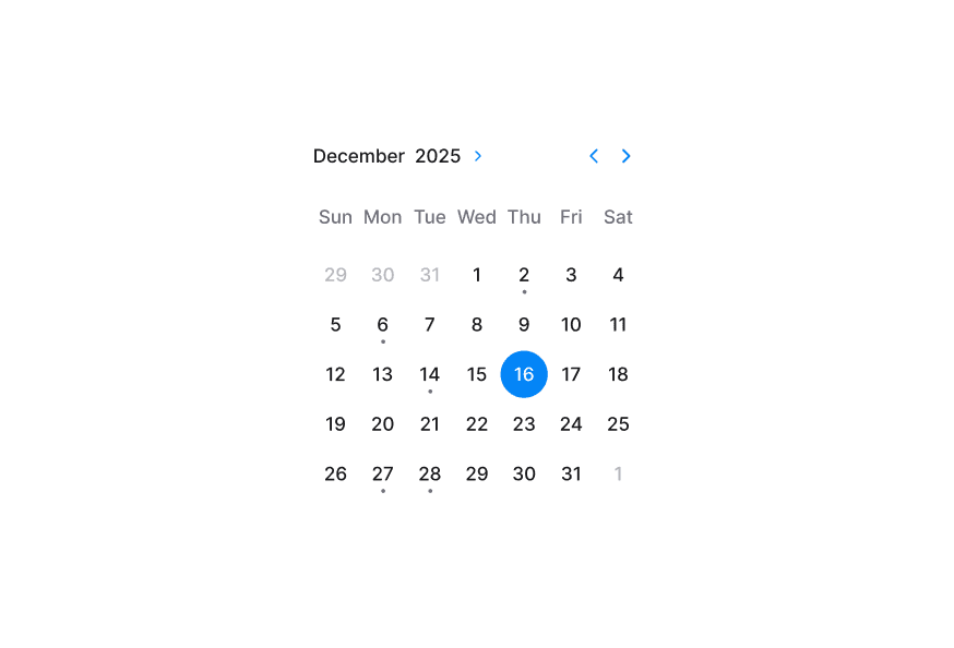
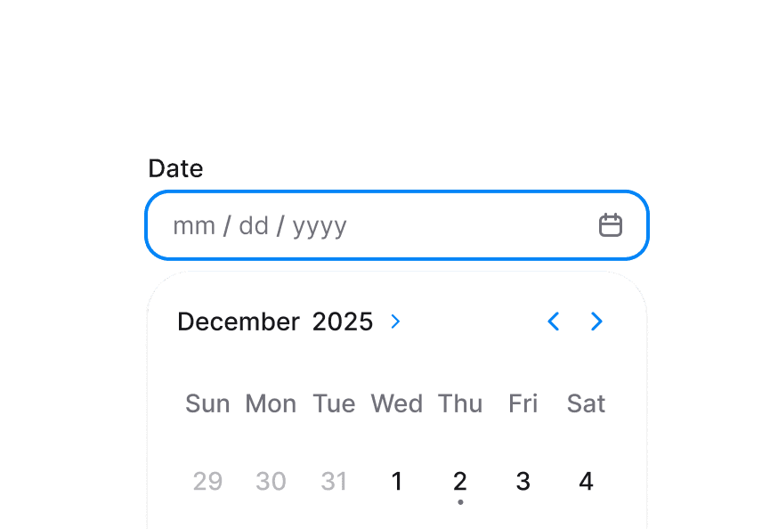
RangeCalendar
Composable date range picker with month grid, navigation, and year picker support built on React Aria RangeCalendar
Import
import { RangeCalendar } from '@darkcode-ui/react';Usage
"use client";

import {RangeCalendar} from "@darkcode-ui/react";

export function Basic() {Anatomy
import {RangeCalendar} from '@darkcode-ui/react';

export default () => (
  <RangeCalendar aria-label="Trip dates">
    <RangeCalendar.Header>
      <RangeCalendar.Heading />
      <RangeCalendar.NavButton slot="previous" />
      <RangeCalendar.NavButton slot="next" />
    </RangeCalendar.Header>
    <RangeCalendar.Grid>
      <RangeCalendar.GridHeader>
        {(day) => <RangeCalendar.HeaderCell>{day}</RangeCalendar.HeaderCell>}
      </RangeCalendar.GridHeader>
      <RangeCalendar.GridBody>
        {(date) => <RangeCalendar.Cell date={date} />}
      </RangeCalendar.GridBody>
    </RangeCalendar.Grid>
  </RangeCalendar>
)
Year Picker
RangeCalendar.YearPickerTrigger, RangeCalendar.YearPickerGrid, and their body/cell subcomponents provide an integrated year navigation pattern.
"use client";

import {RangeCalendar} from "@darkcode-ui/react";

export function YearPicker() {Default Value
"use client";

import {RangeCalendar} from "@darkcode-ui/react";
import {parseDate} from "@internationalized/date";
Controlled
"use client";

import type {DateValue} from "@internationalized/date";

import {Button, ButtonGroup, Description, RangeCalendar} from "@darkcode-ui/react";Min and Max Dates
"use client";

import {Description, RangeCalendar} from "@darkcode-ui/react";
import {getLocalTimeZone, today} from "@internationalized/date";
Unavailable Dates
Use isDateUnavailable to block dates such as weekends, holidays, or booked slots.
"use client";

import type {DateValue} from "@internationalized/date";

import {Description, RangeCalendar} from "@darkcode-ui/react";Allows Non-Contiguous Ranges
Enable allowsNonContiguousRanges to allow selection across unavailable dates.
"use client";

import type {DateValue} from "@internationalized/date";

import {Description, RangeCalendar} from "@darkcode-ui/react";Disabled
"use client";

import {Description, RangeCalendar} from "@darkcode-ui/react";

export function Disabled() {Read Only
"use client";

import {Description, RangeCalendar} from "@darkcode-ui/react";
import {getLocalTimeZone, today} from "@internationalized/date";
Invalid
"use client";

import type {DateValue} from "@internationalized/date";

import {Description, RangeCalendar} from "@darkcode-ui/react";Focused Value
"use client";

import type {DateValue} from "@internationalized/date";

import {Button, Description, RangeCalendar} from "@darkcode-ui/react";Cell Indicators
You can customize RangeCalendar.Cell children and use RangeCalendar.CellIndicator to display metadata like events.
"use client";

import {RangeCalendar} from "@darkcode-ui/react";
import {getLocalTimeZone, isToday} from "@internationalized/date";
Multiple Months
Render multiple grids with visibleDuration and offset for booking and planning experiences.
"use client";

import {RangeCalendar} from "@darkcode-ui/react";
import {getLocalTimeZone} from "@internationalized/date";
import React from "react";Week View
Select a range across a fixed number of weeks by passing visibleDuration={{weeks: n}}. The grid keeps its seven columns.
"use client";

import {RangeCalendar} from "@darkcode-ui/react";

export function WeekView() {Day View
Select a range within a horizontal strip of days by passing visibleDuration={{days: n}}. The column count follows the visible day span (capped at seven).
"use client";

import {RangeCalendar} from "@darkcode-ui/react";

export function DayView() {International Calendars
By default, RangeCalendar displays dates using the calendar system for the user's locale. You can override this by wrapping your RangeCalendar with I18nProvider and setting the Unicode calendar locale extension.
The example below shows the Indian calendar system:
"use client";

import {RangeCalendar} from "@darkcode-ui/react";
import {I18nProvider} from "react-aria-components";
Note: The onChange event always returns a date in the same calendar system as the value or defaultValue (Gregorian if no value is provided), regardless of the displayed locale.
Real-World Example
"use client";

import type {DateValue} from "@internationalized/date";

import {Button, RangeCalendar} from "@darkcode-ui/react";Styling
Passing Tailwind CSS classes
import {RangeCalendar} from '@darkcode-ui/react';

function CustomRangeCalendar() {
  return (
    <RangeCalendar aria-label="Trip dates" className="w-80 rounded-2xl border border-border bg-surface p-3 shadow-sm">
      <RangeCalendar.Header className="pb-3">
        <RangeCalendar.Heading className="text-default" />
        <RangeCalendar.NavButton slot="previous" className="text-default" />
        <RangeCalendar.NavButton slot="next" className="text-default" />
      </RangeCalendar.Header>
      <RangeCalendar.Grid>
        <RangeCalendar.GridHeader>
          {(day) => <RangeCalendar.HeaderCell>{day}</RangeCalendar.HeaderCell>}
        </RangeCalendar.GridHeader>
        <RangeCalendar.GridBody>
          {(date) => <RangeCalendar.Cell date={date} />}
        </RangeCalendar.GridBody>
      </RangeCalendar.Grid>
    </RangeCalendar>
  );
}
Customizing the component classes
@layer components {
  .range-calendar {
    @apply w-80 rounded-2xl border border-border bg-surface p-3 shadow-sm;
  }

  .range-calendar__heading {
    @apply text-sm font-semibold text-default;
  }

  .range-calendar__cell[data-selected="true"] .range-calendar__cell-button {
    @apply bg-accent text-accent-foreground;
  }
}
CSS Classes
RangeCalendar uses these classes in packages/styles/components/range-calendar.css and packages/styles/components/calendar-year-picker.css:
.range-calendar- Root container..range-calendar__header- Header row containing nav buttons and heading..range-calendar__heading- Current month label..range-calendar__nav-button- Previous/next navigation controls..range-calendar__grid- Main day grid..range-calendar__grid-header- Weekday header row wrapper..range-calendar__grid-body- Date rows wrapper..range-calendar__header-cell- Weekday header cell..range-calendar__cell- Interactive day cell wrapper..range-calendar__cell-button- Interactive day button inside each cell..range-calendar__cell-indicator- Dot indicator inside a day cell..calendar-year-picker__trigger- Year picker toggle button..calendar-year-picker__trigger-heading- Heading text inside year picker trigger..calendar-year-picker__trigger-indicator- Indicator icon inside year picker trigger..calendar-year-picker__year-grid- Overlay grid of selectable years..calendar-year-picker__year-cell- Individual year option.
Interactive States
RangeCalendar supports both pseudo-classes and React Aria data attributes:
- Selected:
[data-selected="true"] - Selection start:
[data-selection-start="true"] - Selection end:
[data-selection-end="true"] - Range middle:
[data-selection-in-range="true"] - Today:
[data-today="true"] - Unavailable:
[data-unavailable="true"] - Outside month:
[data-outside-month="true"] - Hovered:
:hoveror[data-hovered="true"] - Pressed:
:activeor[data-pressed="true"] - Focus visible:
:focus-visibleor[data-focus-visible="true"] - Disabled:
:disabledor[data-disabled="true"]
API Reference
RangeCalendar Props
RangeCalendar inherits all props from React Aria RangeCalendar.
| Prop | Type | Default | Description |
|---|---|---|---|
value | RangeValue<DateValue> | null | - | Controlled selected range. |
defaultValue | RangeValue<DateValue> | null | - | Initial selected range (uncontrolled). |
onChange | (value: RangeValue<DateValue>) => void | - | Called when selection changes. |
focusedValue | DateValue | - | Controlled focused date. |
onFocusChange | (value: DateValue) => void | - | Called when focus moves to another date. |
minValue | DateValue | Calendar-aware 1900-01-01 | Earliest selectable date. |
maxValue | DateValue | Calendar-aware 2099-12-31 | Latest selectable date. |
isDateUnavailable | (date: DateValue) => boolean | - | Marks dates as unavailable. |
allowsNonContiguousRanges | boolean | false | Allows ranges that span unavailable dates. |
isDisabled | boolean | false | Disables interaction and selection. |
isReadOnly | boolean | false | Keeps content readable but prevents selection changes. |
isInvalid | boolean | false | Marks the calendar as invalid for validation UI. |
visibleDuration | {months?: number} | {months: 1} | Number of visible months. |
defaultYearPickerOpen | boolean | false | Initial open state of internal year picker. |
isYearPickerOpen | boolean | - | Controlled year picker open state. |
onYearPickerOpenChange | (isOpen: boolean) => void | - | Called when year picker open state changes. |
Composition Parts
| Component | Description |
|---|---|
RangeCalendar.Header | Header container for navigation and heading. |
RangeCalendar.Heading | Current month/year heading. |
RangeCalendar.NavButton | Previous/next navigation control (slot="previous" or slot="next"). |
RangeCalendar.Grid | Day grid for one month (offset supported for multi-month layouts). |
RangeCalendar.GridHeader | Weekday header container. |
RangeCalendar.GridBody | Date cell body container. |
RangeCalendar.HeaderCell | Weekday label cell. |
RangeCalendar.Cell | Individual date cell. |
RangeCalendar.CellIndicator | Optional indicator element for custom metadata. |
RangeCalendar.YearPickerTrigger | Trigger to toggle year-picker mode. |
RangeCalendar.YearPickerTriggerHeading | Localized heading content inside the year-picker trigger. |
RangeCalendar.YearPickerTriggerIndicator | Toggle icon inside the year-picker trigger. |
RangeCalendar.YearPickerGrid | Overlay year selection grid container. |
RangeCalendar.YearPickerGridBody | Body renderer for year grid cells. |
RangeCalendar.YearPickerCell | Individual year option cell. |
RangeCalendar.Cell Render Props
When RangeCalendar.Cell children is a function, React Aria render props are available:
| Prop | Type | Description |
|---|---|---|
formattedDate | string | Localized day label for the cell. |
isSelected | boolean | Whether the date is selected. |
isSelectionStart | boolean | Whether the date is the start of the selected range. |
isSelectionEnd | boolean | Whether the date is the end of the selected range. |
isUnavailable | boolean | Whether the date is unavailable. |
isDisabled | boolean | Whether the cell is disabled. |
isOutsideMonth | boolean | Whether the date belongs to adjacent month. |
For a complete list of supported calendar systems and their identifiers, see:
Related packages
@internationalized/date— date types (CalendarDate,CalendarDateTime,ZonedDateTime) and utilities used by all date componentsI18nProvider— override locale for a subtreeuseLocale— read the current locale and layout direction