ColorPicker
A composable color picker that synchronizes color value between multiple color components
Import
import {
  ColorPicker,
  ColorArea,
  ColorSlider,
  ColorSwatch,
  ColorField,
  ColorSwatchPicker,
} from '@darkcode-ui/react';
Usage
import {ColorArea, ColorPicker, ColorSlider, ColorSwatch, Label} from "@darkcode-ui/react";

export function Basic() {
  return (
<ColorPicker defaultValue="#0485F7">Anatomy
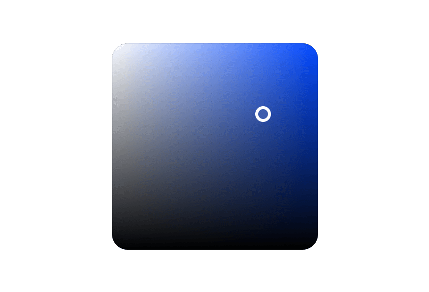
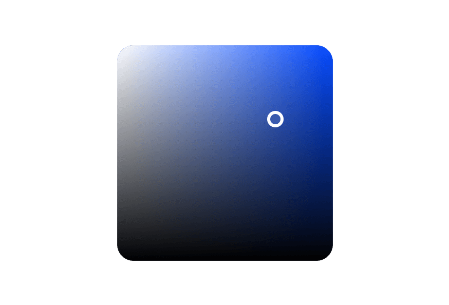
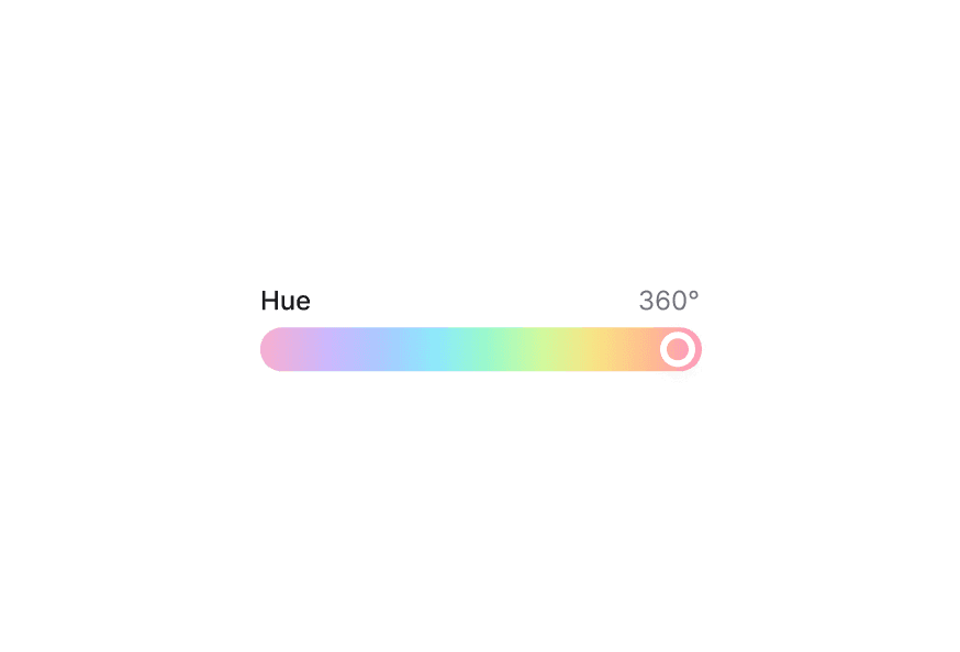
The ColorPicker is a composable component that combines multiple color components:
import { ColorPicker, ColorArea, ColorSlider, ColorSwatch, Label } from '@darkcode-ui/react';

export default () => (
  <ColorPicker defaultValue="#0485F7">
    <ColorPicker.Trigger>
      <ColorSwatch />
      <Label>Pick a color</Label>
    </ColorPicker.Trigger>
    <ColorPicker.Popover>
      <ColorArea colorSpace="hsb" xChannel="saturation" yChannel="brightness">
        <ColorArea.Thumb />
      </ColorArea>
      <ColorSlider channel="hue" colorSpace="hsb">
        <ColorSlider.Track>
          <ColorSlider.Thumb />
        </ColorSlider.Track>
      </ColorSlider>
    </ColorPicker.Popover>
  </ColorPicker>
);
Controlled
"use client";

import {
  Button,
ColorArea,With Swatches
import {
  ColorArea,
  ColorPicker,
  ColorSlider,
ColorSwatch,With Fields
Use ColorField to allow users to edit individual color channel values with a Select to switch between color spaces.
"use client";

import type {ColorChannel, ColorSpace} from "@darkcode-ui/react";

import {With Sliders
Use multiple ColorSlider components to adjust each channel of a color value.
"use client";

import type {ColorChannel, ColorSpace} from "@darkcode-ui/react";

import {ColorPicker, ColorSlider, ColorSwatch, Label, ListBox, Select} from "@darkcode-ui/react";Eyedropper
Add ColorPicker.EyeDropper to let users sample a color from anywhere on screen using the
native EyeDropper API. The
button automatically hides where the API is unavailable (set unsupportedBehavior="disable"
to render it disabled instead). Place it inside the Popover, never inside the Trigger.
"use client";

import {ColorArea, ColorPicker, ColorSlider, ColorSwatch, Label} from "@darkcode-ui/react";

export function WithEyeDropper() {Recent colors
Set recordHistory on the root and drop in ColorPicker.Recent to show a persisted row of
recently used colors. History is stored in localStorage and powered by the
useColorHistory hook.
"use client";

import {ColorArea, ColorPicker, ColorSlider, ColorSwatch, Label} from "@darkcode-ui/react";

const recentColors = ["#ef4444", "#f97316", "#eab308", "#22c55e", "#3b82f6", "#8b5cf6"];Copy to clipboard
ColorPicker.CopyButton copies the current color (hex by default) and shows a transient
check. Pass format to copy rgb, hsl, hexa, etc.
"use client";

import {ColorArea, ColorPicker, ColorSlider, ColorSwatch, Label} from "@darkcode-ui/react";

export function WithCopy() {Styling
Passing Tailwind CSS classes
import { ColorPicker, ColorArea, ColorSlider, ColorSwatch, Label } from '@darkcode-ui/react';

function CustomColorPicker() {
  return (
    <ColorPicker defaultValue="#0485F7">
      <ColorPicker.Trigger className="gap-4">
        <ColorSwatch className="rounded-lg" />
        <Label>Pick a color</Label>
      </ColorPicker.Trigger>
      <ColorPicker.Popover className="p-4 rounded-xl">
        <ColorArea colorSpace="hsb" xChannel="saturation" yChannel="brightness">
          <ColorArea.Thumb />
        </ColorArea>
      </ColorPicker.Popover>
    </ColorPicker>
  );
}
Customizing the component classes
To customize the ColorPicker component classes, you can use the @layer components directive.
Learn more.
@layer components {
  .color-picker {
    @apply inline-flex;
  }

  .color-picker__trigger {
    @apply inline-flex items-center gap-4 rounded-lg;
  }

  .color-picker__popover {
    @apply p-4 rounded-xl;
  }
}
DarkCode UI follows the BEM methodology to ensure component variants and states are reusable and easy to customize.
CSS Classes
The ColorPicker component uses these CSS classes (View source styles):
Base Classes
.color-picker- Base container.color-picker__trigger- Trigger button.color-picker__popover- Popover container
Interactive States
The component supports both CSS pseudo-classes and data attributes for flexibility:
- Focus:
:focus-visibleor[data-focus-visible="true"] - Disabled:
:disabledor[data-disabled="true"]
API Reference
ColorPicker Props
Inherits from React Aria ColorPicker.
| Prop | Type | Default | Description |
|---|---|---|---|
value | string | Color | - | The current color value (controlled) |
defaultValue | string | Color | - | The default color value (uncontrolled) |
onChange | (color: Color) => void | - | Handler called when the color changes |
recordHistory | boolean | false | Track the committed color in a recent-colors history (consumed by ColorPicker.Recent) |
historyOptions | UseColorHistoryOptions | - | Options forwarded to the underlying useColorHistory hook |
children | React.ReactNode | - | Content of the color picker (Trigger, Popover, etc.) |
className | string | - | Additional CSS classes |
ColorPicker.Trigger Props
| Prop | Type | Default | Description |
|---|---|---|---|
children | React.ReactNode | ((renderProps) => React.ReactNode) | - | Trigger content or render prop |
className | string | - | Additional CSS classes |
ColorPicker.Popover Props
| Prop | Type | Default | Description |
|---|---|---|---|
placement | Placement | "bottom left" | Placement of the popover |
children | React.ReactNode | - | Popover content |
className | string | - | Additional CSS classes |
ColorPicker.EyeDropper Props
Wraps React Aria Button. Must be
placed inside the Popover.
| Prop | Type | Default | Description |
|---|---|---|---|
unsupportedBehavior | 'hide' | 'disable' | 'hide' | What to do where the EyeDropper API is unavailable |
children | React.ReactNode | - | Override the icon/content |
ColorPicker.CopyButton Props
| Prop | Type | Default | Description |
|---|---|---|---|
format | 'hex' | 'hexa' | 'css' | 'rgb' | 'hsl' | 'hsb' | ((color: Color) => string) | 'hex' | The value copied to the clipboard |
uppercase | boolean | true | Uppercase the value for hex formats |
children | React.ReactNode | (({ copied }) => React.ReactNode) | - | Override the button content |
ColorPicker.Recent Props
| Prop | Type | Default | Description |
|---|---|---|---|
colors | string[] | - | Explicit colors; falls back to the ColorPicker history |
onColorSelect | (color: string) => void | - | Called on select; defaults to applying the color |
label | React.ReactNode | - | Optional heading above the swatches |
size | 'xs' | 'sm' | 'md' | 'xs' | Swatch size |
Hooks
These reusable hooks power the parts above and can be used standalone.
useColorHistory
useColorHistory({ storageKey?, maxLength?, colors?, defaultColors?, onChange? }) → { colors, addColor, clear }.
Tracks recently used colors in localStorage (deduped, newest first, capped at maxLength, default 8).
Pass storageKey: null to keep history in memory only.
useEyeDropper
useEyeDropper({ onResult?, onError? }) → { isSupported, isOpen, open }. Feature-detects and
opens the native EyeDropper. isSupported is false during SSR and on unsupported browsers.
useClipboard
useClipboard({ timeout? }) → { copy, copied, error }. Copies text with a transient copied
flag that resets after timeout ms (default 2000).
Related Types
Color
Represents a color value. See React Aria Color for full API.
| Method | Description |
|---|---|
toString(format) | Converts the color to a string in the given format (hex, rgb, hsl, hsb, css) |
toFormat(format) | Converts the color to the given format and returns a new Color object |
getChannelValue(channel) | Returns the numeric value for a given channel |
withChannelValue(channel, value) | Sets the numeric value for a channel and returns a new Color |
parseColor
import { parseColor } from 'react-aria-components';

// Parse from string
const color = parseColor('#ff0000');
const hslColor = parseColor('hsl(0, 100%, 50%)');