RadioButtonGroup
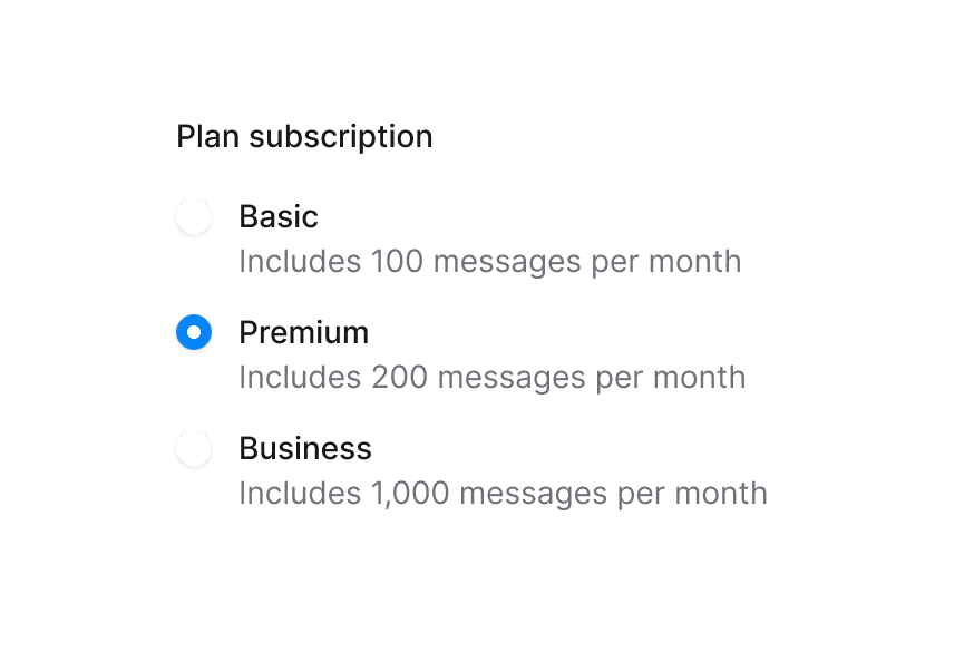
A single-selection button group with card-style radio options, icons, and custom indicators
Import
import { RadioButtonGroup } from '@darkcode-ui/react';Usage
import {Description, Label, RadioButtonGroup} from "@darkcode-ui/react";

const plans = [
  {description: "For side projects and small teams", title: "Starter", value: "starter"},
{description: "Advanced reporting and analytics", title: "Pro", value: "pro"},Anatomy
Import the RadioButtonGroup component and access all parts using dot notation.
import {RadioButtonGroup, Label, Description} from '@darkcode-ui/react';

export default () => (
  <RadioButtonGroup>
    <Label />
    <RadioButtonGroup.Item value="option1">
      <RadioButtonGroup.ItemIcon />
      <RadioButtonGroup.ItemContent>
        <Label />
        <Description />
      </RadioButtonGroup.ItemContent>
      <RadioButtonGroup.Indicator />
    </RadioButtonGroup.Item>
  </RadioButtonGroup>
)
Delivery & Payment
import {Description, Label, RadioButtonGroup} from "@darkcode-ui/react";
import {Icon} from "@iconify/react";

const deliveryOptions = [
{description: "4-10 business days", price: "$5.00", title: "Standard", value: "standard"},Subscription Plans
import {Chip, Label, RadioButtonGroup} from "@darkcode-ui/react";
import {Icon} from "@iconify/react";

const subscriptions = [
{features: ["10 projects", "Community support"], price: "$0", title: "Free", value: "free"},Controlled
"use client";

import {Description, Label, RadioButtonGroup} from "@darkcode-ui/react";
import React from "react";
Custom Indicator
Pass children to RadioButtonGroup.Indicator to render a custom icon that appears only when the item is selected.
import {Description, Label, RadioButtonGroup} from "@darkcode-ui/react";
import {Icon} from "@iconify/react";

const plans = [
{description: "For side projects and small teams", title: "Starter", value: "starter"},Disabled Group
import {Description, Label, RadioButtonGroup} from "@darkcode-ui/react";

const plans = [
  {description: "For side projects and small teams", title: "Starter", value: "starter"},
{description: "Advanced reporting and analytics", title: "Pro", value: "pro"},Grid Layout
Set layout="grid" to arrange items in a responsive grid. Override the columns with a Tailwind class on the root.
import {Description, Label, RadioButtonGroup} from "@darkcode-ui/react";

const options = [
  {description: "1 vCPU · 2 GB RAM", title: "Nano", value: "nano"},
{description: "2 vCPU · 4 GB RAM", title: "Micro", value: "micro"},Icon Cards
import {Label, RadioButtonGroup} from "@darkcode-ui/react";
import {Icon} from "@iconify/react";

const options = [
{icon: "gravity-ui:rocket", title: "Startup", value: "startup"},No Indicator
Omit RadioButtonGroup.Indicator to rely on the selection ring alone.
import {Description, Label, RadioButtonGroup} from "@darkcode-ui/react";

const plans = [
  {description: "For side projects and small teams", title: "Starter", value: "starter"},
{description: "Advanced reporting and analytics", title: "Pro", value: "pro"},Render Prop Children
RadioButtonGroup.Item accepts a render function that receives the radio's selection state.
"use client";

import {Description, Label, RadioButtonGroup} from "@darkcode-ui/react";
import {Icon} from "@iconify/react";
With Icons
import {Description, Label, RadioButtonGroup} from "@darkcode-ui/react";
import {Icon} from "@iconify/react";

const options = [
{With Ripple
Add the ripple prop to RadioButtonGroup.Item for a press ripple effect.
import {Description, Label, RadioButtonGroup} from "@darkcode-ui/react";

const plans = [
  {description: "For side projects and small teams", title: "Starter", value: "starter"},
{description: "Advanced reporting and analytics", title: "Pro", value: "pro"},Styling
RadioButtonGroup builds on top of the RadioGroup and Radio primitives, adding card-style layout, a positioned indicator, and a leading icon slot.
CSS Classes
The RadioButtonGroup component uses these CSS classes (View source styles):
Base Classes
.radio-button-group- Base RadioGroup container with flex layout
Layout Classes
.radio-button-group--grid- Grid layout mode
Element Classes
.radio-button-group__item- Card-like radio button with border and selection ring.radio-button-group__indicator- Positioned top-right indicator (radio dot or custom icon).radio-button-group__item-content- Text/content area wrapping Radio.Content.radio-button-group__item-icon- Leading icon container
Interactive States
- Selected:
[data-selected="true"]on.radio-button-group__item(accent ring) - Focus visible:
:focus-visibleor[data-focus-visible="true"]on.radio-button-group__item(focus ring) - Disabled:
:disabledor[aria-disabled="true"]on.radio-button-group__item(reduced opacity)
CSS Variables
--radio-button-group-item-radius- Border radius of items (default:var(--radius-2xl))
API Reference
RadioButtonGroup
The root component. Wraps DarkCode UI RadioGroup with card-style layout.
| Prop | Type | Default | Description |
|---|---|---|---|
layout | 'flex' | 'grid' | 'flex' | Layout mode for items |
Also supports all DarkCode UI RadioGroup props (value, defaultValue, onChange, isDisabled, isRequired, name, orientation, variant, …).
RadioButtonGroup.Item
A selectable card wrapping DarkCode UI Radio. Supports render prop children for accessing selection state.
| Prop | Type | Default | Description |
|---|---|---|---|
ripple | boolean | false | Whether a ripple animation is shown on press |
Also supports all DarkCode UI Radio props (value, isDisabled, children, …).
RadioButtonGroup.Indicator
Selection indicator positioned at the top-right of the item.
- No children: renders the default DarkCode UI radio dot (Control + Indicator)
- With children: renders a custom icon that appears only when selected
| Prop | Type | Default | Description |
|---|---|---|---|
children | ReactNode | - | Custom indicator icon (shown when selected) |
Also supports all native span HTML attributes.
RadioButtonGroup.ItemContent
Content area for title and description text. Wraps DarkCode UI Radio.Content.
| Prop | Type | Default | Description |
|---|---|---|---|
children | ReactNode | - | Content elements |
Also supports all native div HTML attributes.
RadioButtonGroup.ItemIcon
Leading icon container.
| Prop | Type | Default | Description |
|---|---|---|---|
children | ReactNode | - | Icon element |
Also supports all native div HTML attributes.